type design
HUMVEE SANS
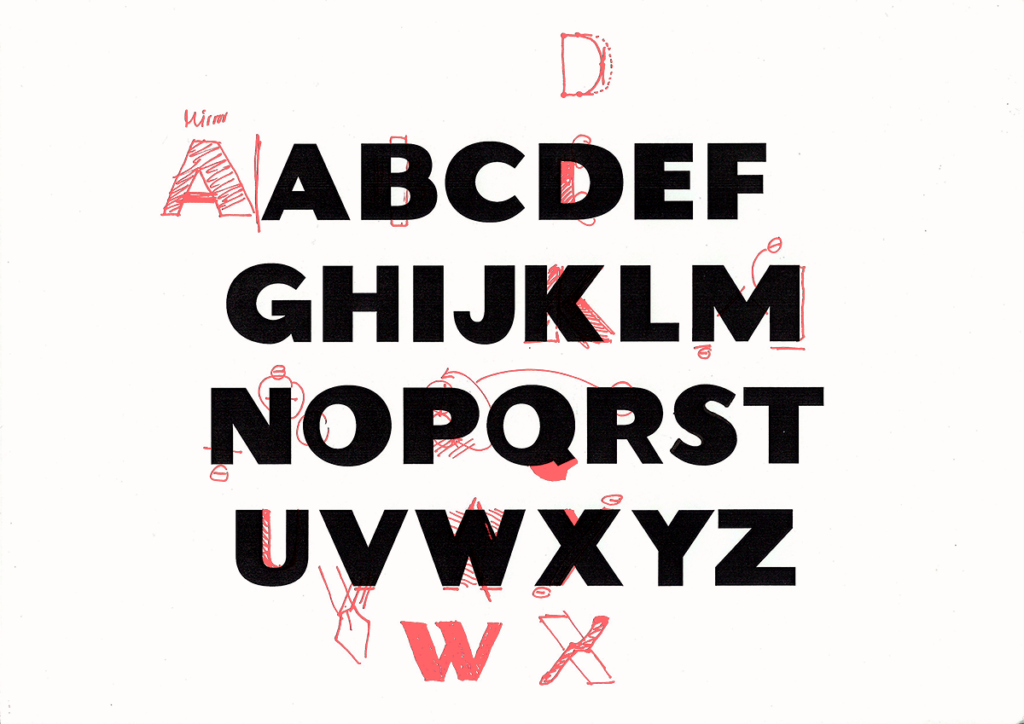
Inspired by a shop sign remaining since ages in the inner city of Graz, my colleague and I decided to give this forgotten and probably misunderstood font a new look. after weeks of moving the edges of every corner of every letter a few pixels in glyphs to the left and then back again – the font package now contains 26 letters and the essential punctuation marks.
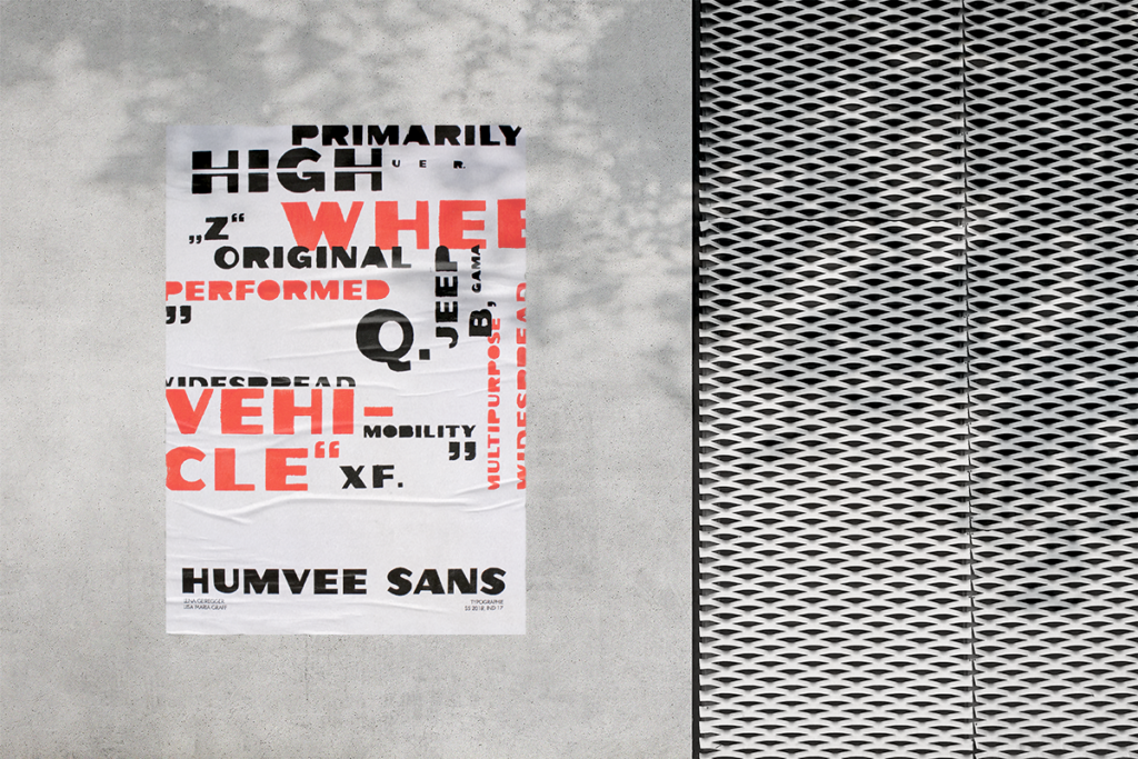
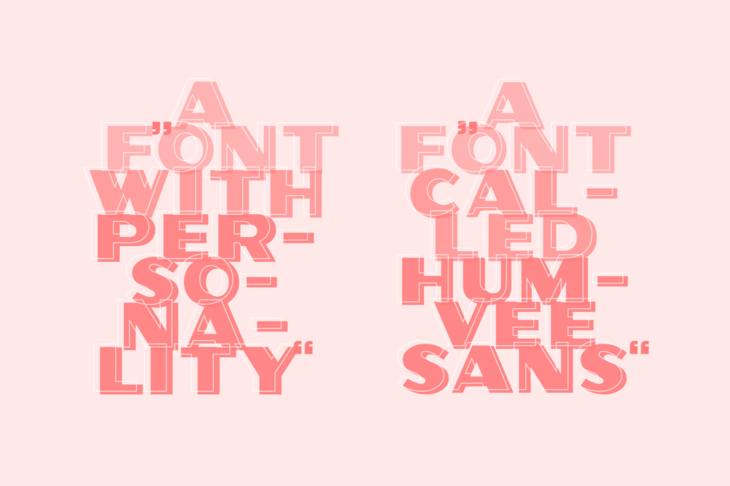
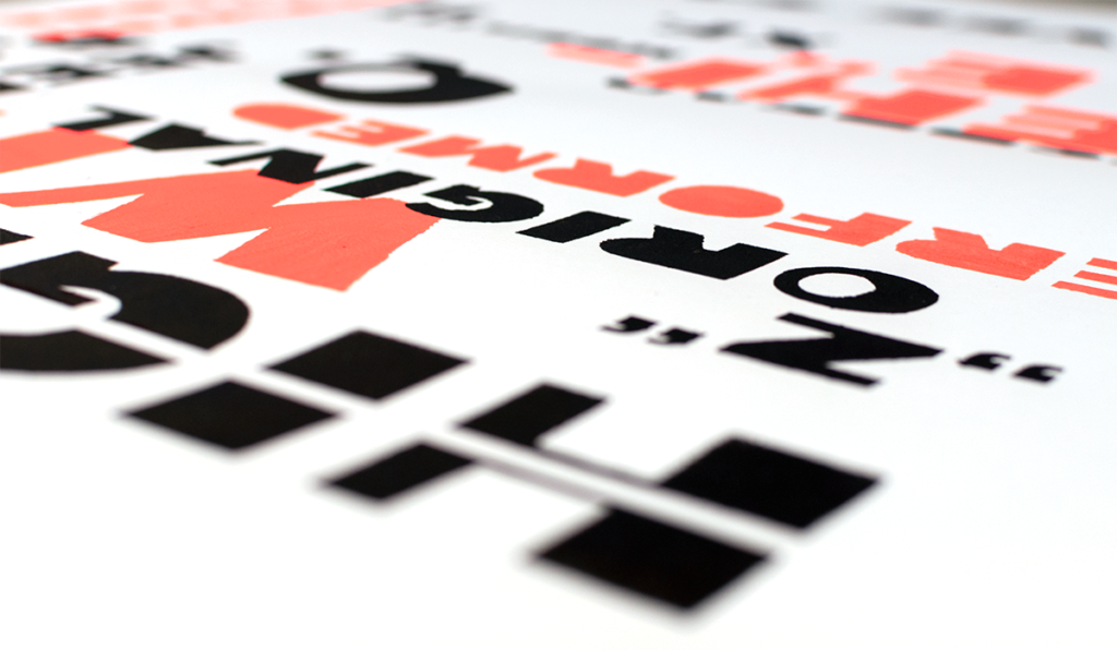
Named after the „high mobility multipurpose wheeled vehicle“ – or short humvee – it suited perfect for such a bold, heavy duty sans serif font, with geometric forms and a lot of contrast. humvee sans is meant to be used for big designs, that long for attention, but still in a elegant, structured and correct way. definitely nothing for the week, because you need to show some courage to give your designs that much personality.
DESIGN FIELD
type design
DATE
march – june 2018
TALENTED DESIGN PARTNER
SOFTWARE USED
glyphs